

A Crucifixion image can direct your attention to Christ alone, to the people who stayed nearby, or to the hill and sky around them. These ten AI-created artworks from Alpha Christian Art explore those choices through color, light and composition.
Read the scene in the Gospels
In John 19:25–27, Jesus speaks to his mother and the beloved disciple from the cross. Luke 23:39–43 describes his exchange with one of the two men crucified beside him. Mark 15:33 records darkness over the land. Keep one of these passages in mind as you look. A painting can give sustained attention to a gesture or a witness that the written account describes in a few lines.
What does the inscription above the cross mean?
INRI abbreviates the Latin Iesus Nazarenus Rex Iudaeorum, or Jesus of Nazareth, King of the Jews. John 19:19–20 describes Pilate’s inscription and says it was written in three languages. In a painting, look first near the top of the vertical beam. Some artists treat the sign as a legible detail, while others leave it understated.
1. Sacred Gold at Calvary
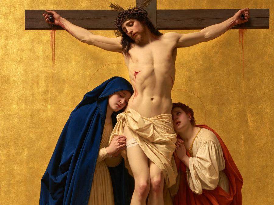
Gold recalls the way devotional panels use a precious-looking field to mark sacred space. Compare how quickly the silhouette reads against this ground with the softer transitions in the umber version.
2. Christ Against the Crimson Field

Crimson gives this interpretation a stronger visual presence. A deep red field can read as solemn in warm lamplight and more striking in daylight. Consider the lighting where you plan to display it.
3. Umber Vigil at Calvary
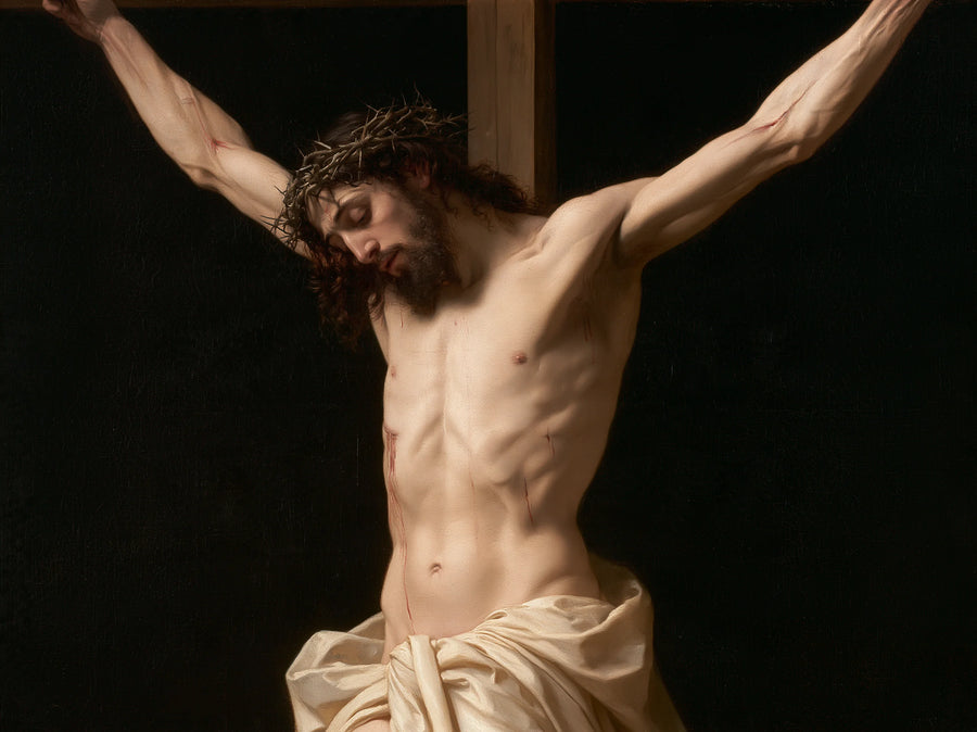
The umber palette is useful for comparing tonal values. Look for where the figure separates from the surrounding browns. A quiet palette gives subtle differences in brightness more responsibility.
4. Ivory Vigil at Calvary
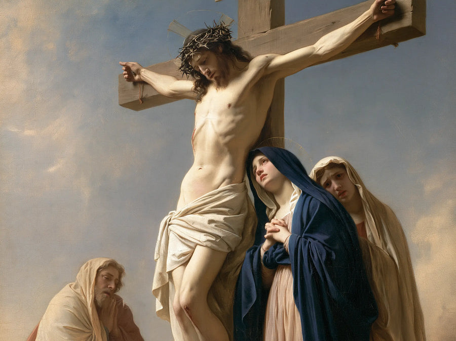
Ivory gives the scene a lighter visual weight. Compare the space around the cross with the night scenes below, especially if you are deciding between a pale print and a darker devotional image.
5. Calvary Beneath the Open Sky
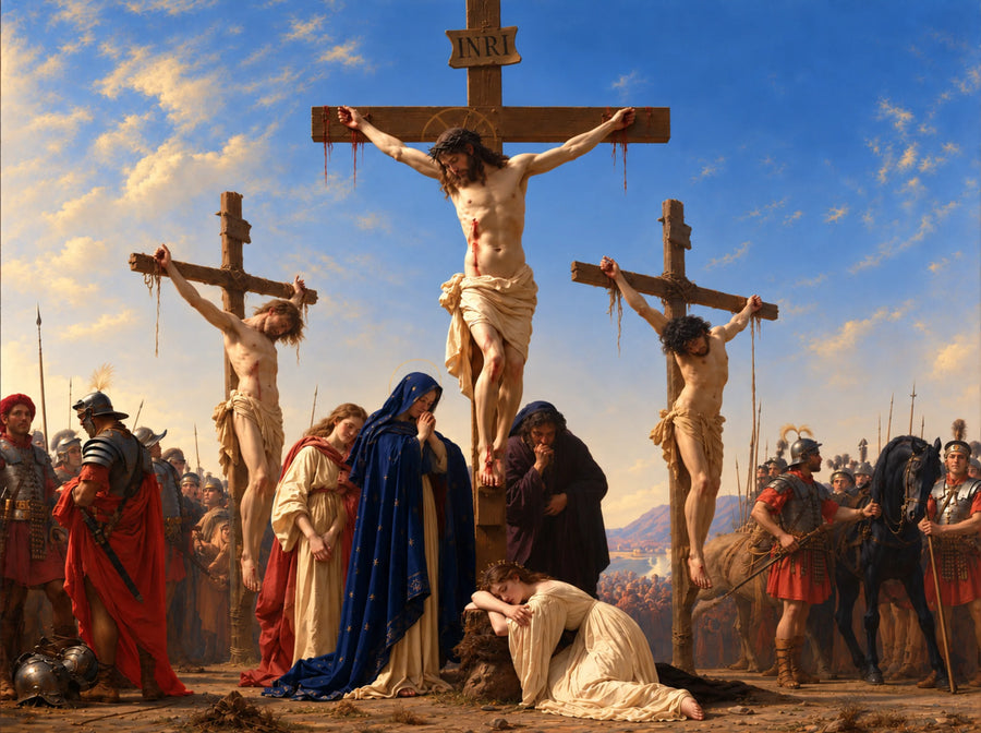
The open sky gives the event a sense of place. Read the scene first as a landscape and then as a devotional image. The position of the cross changes the way your eye moves through both.
6. Prayer Beneath the Blue Sky
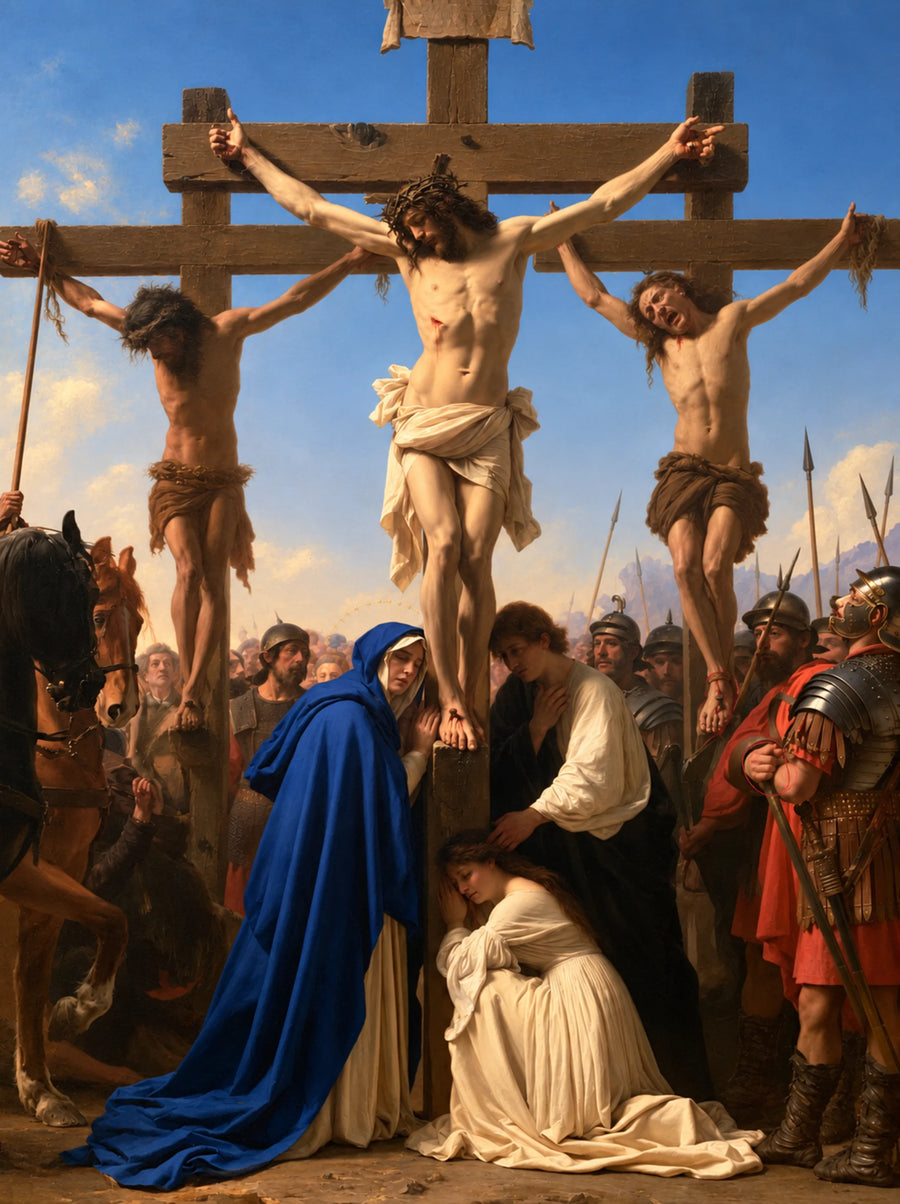
The blue sky offers a cooler setting for the vigil. Read this beside John 19:25–27 and consider how the setting affects your attention to the witnesses.
7. Mourners in Baroque Shadow
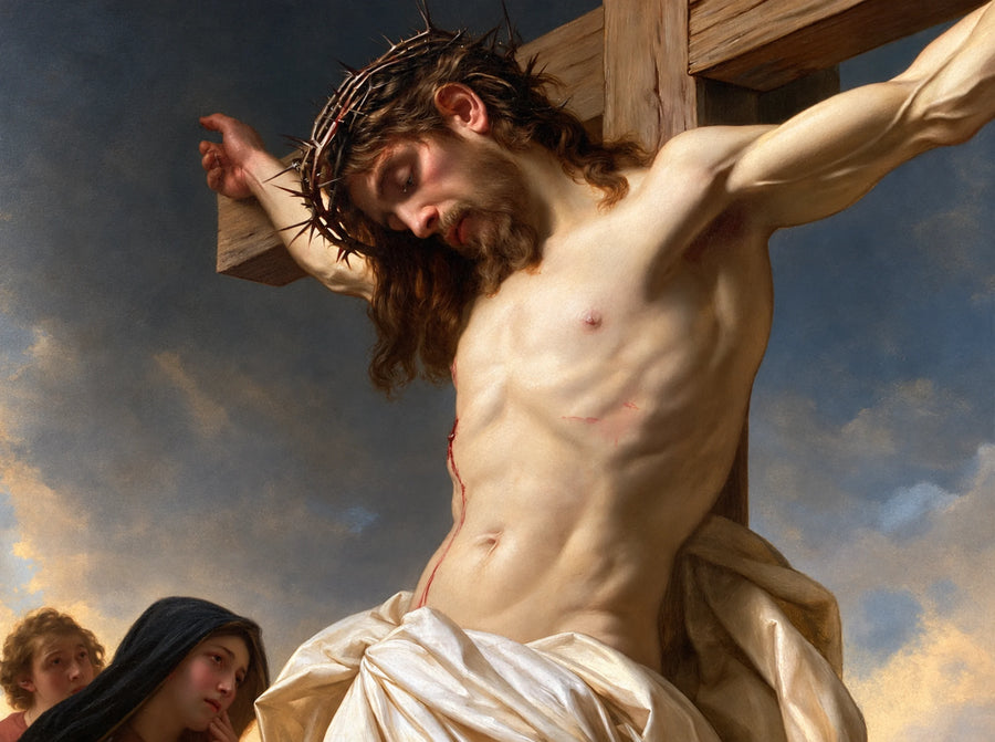
The Baroque-inspired shadows encourage slower looking. Start with the brightest passage and see how much of the gathering becomes legible after your eyes adjust. The preview is especially useful when choosing a small size.
8. Candlelit Silence of the Passion

Candlelight is an artistic interpretation of the Passion. A small source of light narrows the area of attention and can make a scene feel more intimate, even when the wider subject remains solemn.
9. Christ Between the Two Thieves
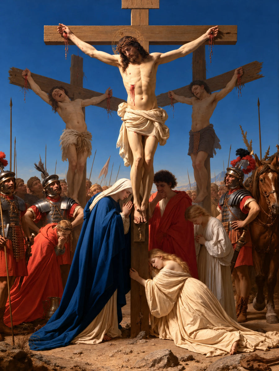
The three crosses recall that two others were crucified alongside Jesus. Luke 23:39–43 gives one of those figures a voice. Look at how the spacing of the crosses shapes the relationships between them.
10. Mary and John Beneath the Cross
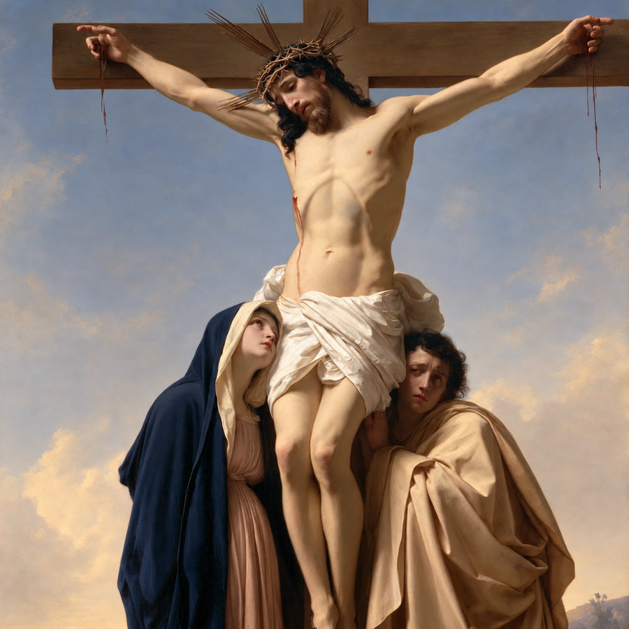
John’s Gospel places Jesus’ mother and the beloved disciple near the cross. Their presence shifts part of the emotional weight to those who remain. Compare this image with the versions that emphasize the cross against an open sky.
Choose a print you can read from where you sit
For a prayer corner, test the likely size by marking the outline on the wall with paper tape. Step back to the place where you normally sit. Check whether you can still see the figures at the foot of the cross. A composition with several witnesses may need more room than a clear silhouette against an open ground.
Look at the darkest passage on the product preview. If your room has low light, a pale or open-sky composition may be easier to read. Compare paper and canvas on the product page and check the available size, finish and frame options before choosing.
Browse the full Crucifixion collection · Explore ten historical Crucifixion paintings